Release 1.9.51.121
Even being a minor release, there are some interesting things which probably grant having a dedicated blog post for them.
linealias
Pull-Request #320 included
the indicator RelativeMomentumIndex (or RMI) which according to the
literature is an evolution of the RSI, which:
- Considers up and down periods with a lookback larger than
1
As such and rather than having an indicator repeating most of what the RSI
does, it seemed useful to do two things:
-
Extend
RSI(and sub-indicators likeUpDayandDownDayto support a lookback period larger than 1.RMIcan then be implemented as a subclass which simply has some different default values. -
The logical name for the line of the
RMIindicator isrmi, but theRSIalready has decided the name asrsi. This is solved by adding a new functionality namedlinealias
The RMI implementation it looks like this:
class RelativeMomentumIndex(RSI):
    alias = ('RMI', )

    linealias = (('rsi', 'rmi',),)  # add an alias for this class rmi -> rsi
    plotlines = dict(rsi=dict(_name='rmi'))  # change line plotting name
An alias for the line rsi from the base class is added, with the name
rmi. If someone wanted to make a subclass and use the name rmi it would
now be possible.
Additionally, the plotting name of the rsi line is also changed to
rmi. An alternative implementation was possible:
class RelativeMomentumIndex(RSI):
    alias = ('RMI', )

    linesoverrride = True  # allow redefinition of the lines hierarcy
    lines = ('rmi',)  # define the line
    linealias = (('rmi', 'rsi',),)  # add an alias for base class rsi -> rmi
Here the existing hierarchy from RSI is no longer considered and lines
is used to define the only line named rmi. There is no need to define the
plotting name, because the only line has now the expected name.
But the base class would fail to fill in the values, because it is expecting a
line with the name rsi to be in place. Hence the addition of a reverse
alias to let it find the line.
Interactive Brokers for Optimization
Using a live connection to Interactive Brokers as the data source for
optimization was not foreseen. Yet a user tried it and pacing violations
started being met. The reason being that the Interactive Brokers data feed
marks itself as being a live feed, allowing the system to bypass some things
like for example data preloading.
With no preloading, each instance of the optimization would retry to
re-download the same historical data from Interactive Brokers. With this in
mind it’s obvious that the feed could look to see if the user has requested
just a historical download and in this case not report itself as live,
allowing the platform to preload the data and share it amongst optimization instances.
See the community thread. Optimizing with IBStore causes redundant connections/downloads
Heikin-Ashi Candlesticks
This other community thread was looking to develop the Heikin-Ashi
candlesticks as an indicator: Develop Heikinashi Indicators,
facing some problems with the recursive definition, because a seed value is
needed, which can be done during the prenext phase of the indicator.
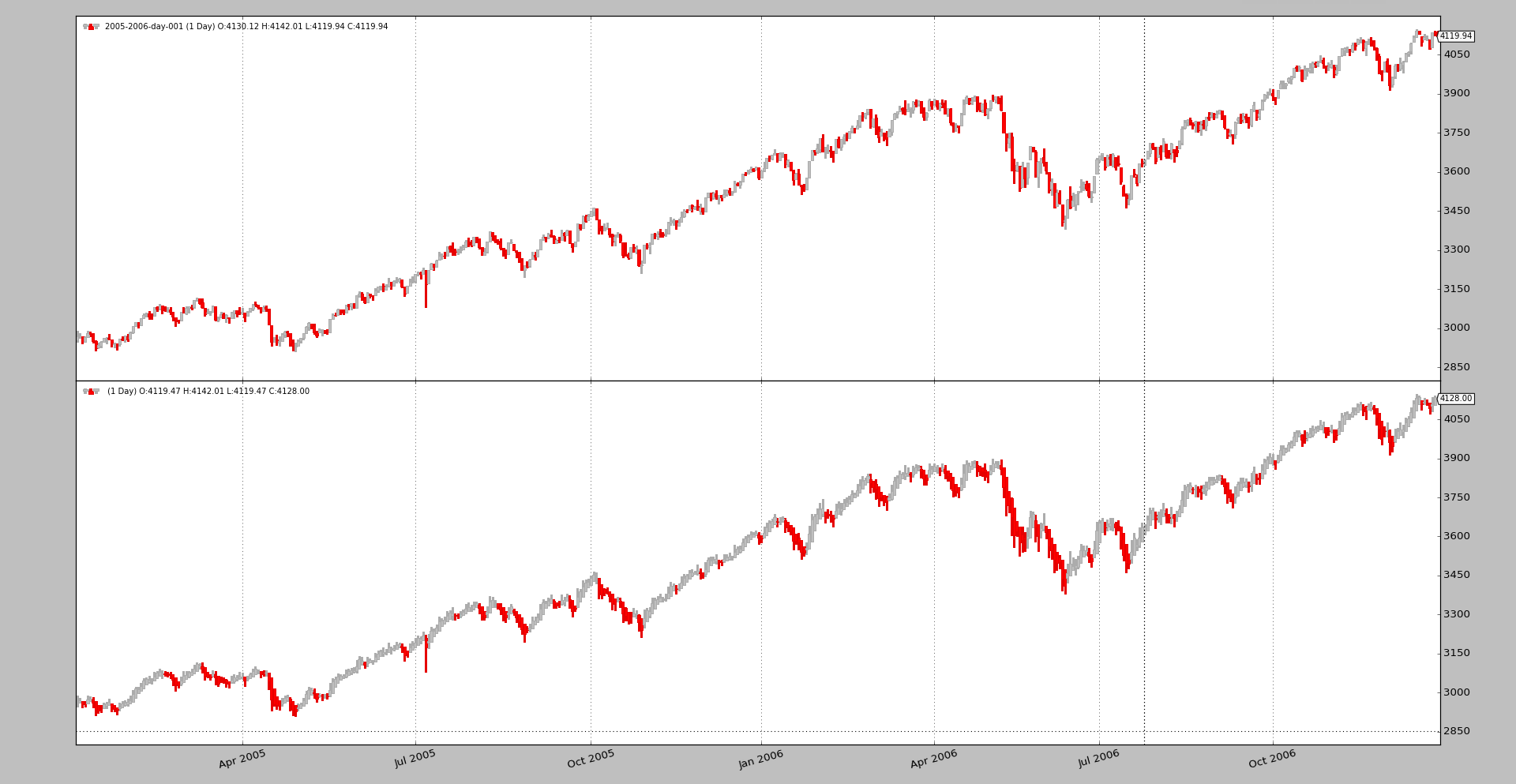
Being an interesting display alternative to the traditional candlesticks, this has been implemented as a filter, which allows to modify the data source to really deliver Heikin-Ashi candlesticks. Just like this:
data0 = MyDataFeed(dataname='xxx', timeframe=bt.TimeFrame.Days, compression=1)
data0.addfilter(bt.filters.HeikinAshi)
cerebro.adddata(data0)
A comparison between the candles can quickly be made by anyone with this code:
data0 = MyDataFeed(dataname='xxx', timeframe=bt.TimeFrame.Days, compression=1)
cerebro.adddata(data0)

data1 = data0.clone()
data1.addfilter(bt.filters.HeikinAshi)
cerebro.adddata(data1)
To plot candles, remember to do:
cerebro.plot(style='candle')
Using the sample daily data for 2005 and 2006 in the sources.
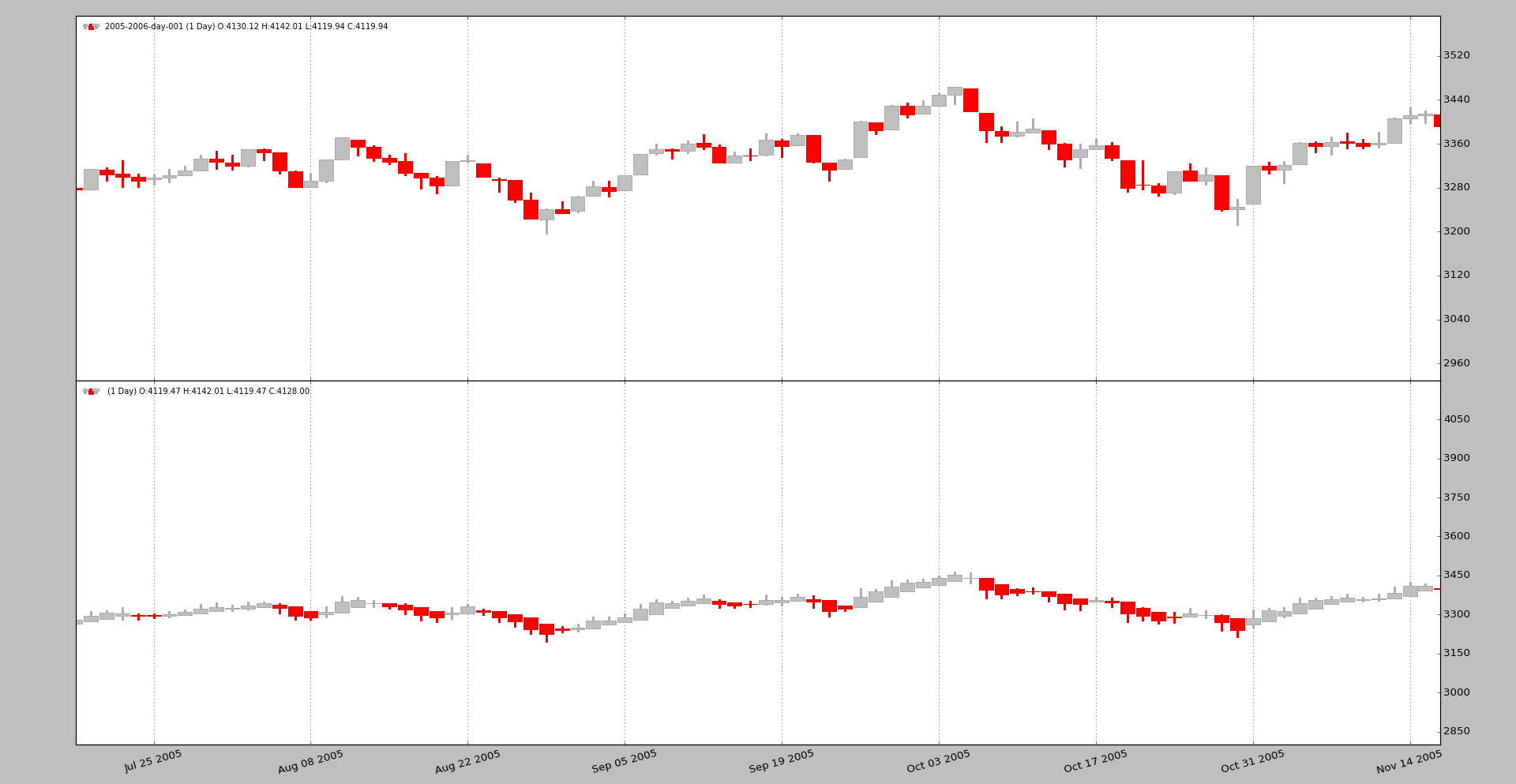
And zooming in a bit to better appreciate the differences
Allowing re-scaling of the y-axis by secondary actors
The axisfor data feeds have always used the main data feed as the
scale-owner, because the data is always the most important part of the view. If
we consider for example the BollingerBands, it could be that the top band
would be far away from the maximum of the data and allowing this band to
re-scale the chart, would reduce the size occupied by the data in the chart,
which wouldn’t be wished.
The behavior can be controlled now with plotylimited as in:
...
data0 = MyDataFeed(dataname='xxx', timeframe=bt.TimeFrame.Days, compression=1)
data0.plotinfo.plotlog = False  # allow other actors to resize the axis
...
In the following chart the data feed at the bottom is plotted with
plotylimited=False. The BollingerBands don’t get off the chart, because
they contribute to the scaling and everything fits in the chart.
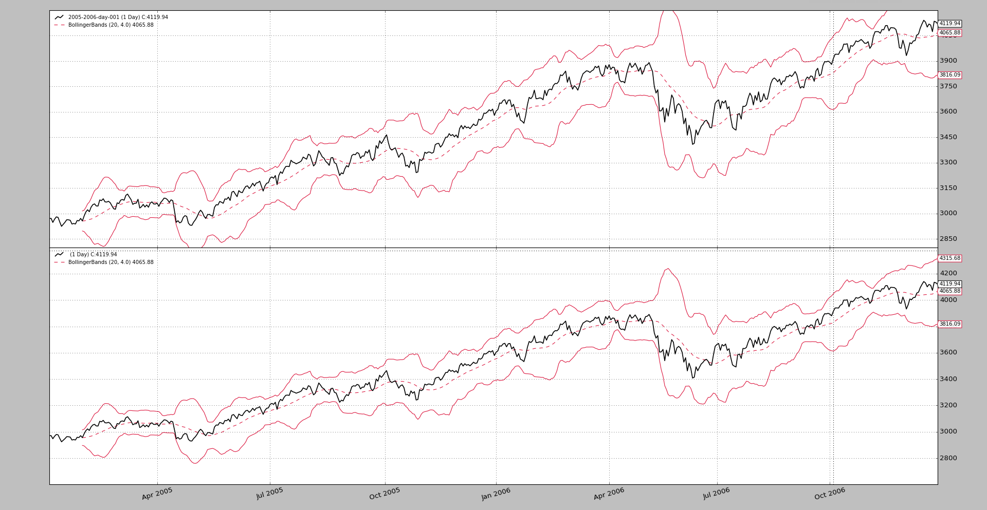
This was also commented in the community. How max - min plot boundaries are set?
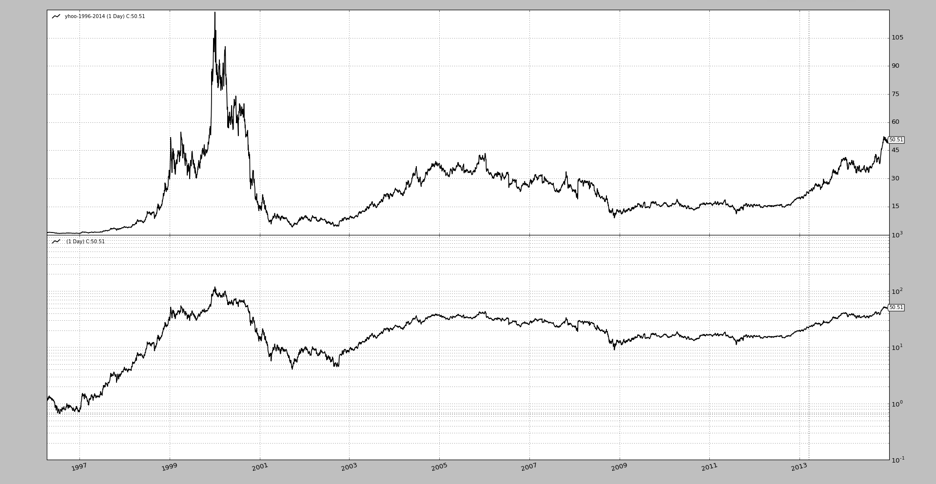
Semilogarithmic Plot (aka Logarithmic)
Individual axis can now be plotted with a semilogarithmic scale (the y-scale). For example with:
...
data0 = MyDataFeed(dataname='xxx', timeframe=bt.TimeFrame.Days, compression=1)
data0.plotinfo.plotlog = True
data0.plotinfo.plotylimited = True
cerebro.adddata(data0)
...
That means that the axis controlled by this data feed for plotting will use a logarithmic scale, but other won’t and therefore
-
A moving average plotted over the data will also be plotted with that scale
-
A stochastic (which is in a different axix and has a different scale) will still be plotted linearly
Note
Notice that plotylimited=True is used. This is to let
matplotlib calculate the limits of the logarithmic chart (because
the ticks are a power of 10) properly to fit things into the chart.
A sample simply comparing a long term period of Yahoo data.
Allow plotmaster to point to itself
Plotting several data feeds on the same axis was already possible, but a small
nuisance didn’t allow a clean loop to set the plotinfo.plotmaster
value. The following had to be done before:
mydatas = []
data = MyDataFeed(dataname=mytickers[0], timeframe=..., compression=...)
mydatafeeds.append(data)
for ticker in mytickers[1:]
    data = MyDataFeed(dataname=ticker, timeframe=..., compression=...)
    mydatafeeds.append(data)
    data.plotinfo.plotmaster = mydatas[0]
And this cleaner loop is possible now:
mydatas = []
for ticker in mytickers:
    data = MyDataFeed(dataname=ticker, timeframe=..., compression=...)
    mydatafeeds.append(data)
    data.plotinfo.plotmaster = mydatas[0]
And dnames got documented
Referencing the data feeds by names was already available, but it had skipped
making it to the documentation, so it was a hidden jewel. The dnames
attribute in the strategy supports dot-notation and [] notation (it is
actually a dict subclass). If we first add some data feeds:
mytickers = ['YHOO', 'IBM', 'AAPL']
for t in mytickers:
  d = bt.feeds.YahooFinanceData(dataname=t, fromdate=..., name=t.lower())
Later in the strategy one can do the following:
def __init__(self):
  yhoosma = bt.ind.SMA(self.dnames.yhoo, period=20)
  aaplsma = bt.ind.SMA(self.dnames['aapl'], period=30)

  # or even go over the keys/items/values like in a regular dict
  # for example with a dictionary comprehension
  stocs = {name: bt.ind.Stochastic(data) for name, data in self.dnames.items()}
Conclusion
A small release with small changes which adds some nifty features.